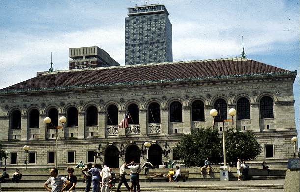
This classic Renaissance Revival building was
the intellectual cornerstone of Copley Square.
The richly appointed interiors impart a feeling
of respect on all who come to drink from this
well of knowledge.

Boston is a grand old city richly textured with delightful buildings and a few warts. Happily, not all of her charming features have been lost, just harder to find among some of the more recent additions that seem glaringly out of place. Come with me on a visual tour and examine for yourself what I find to be the good, the bad and the ugly!
|
|
| The Good: Boston
Public Library 1895
This classic Renaissance Revival building was the intellectual cornerstone of Copley Square. The richly appointed interiors impart a feeling of respect on all who come to drink from this well of knowledge. |
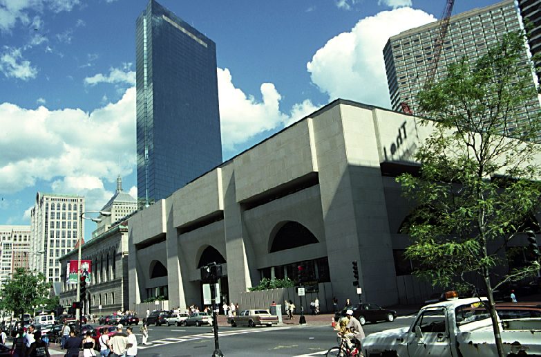
The Bad: This Unsympathetic Library Addition of 1971 looks like a carved pumpkin the month after Halloween or my old neighbor in East Boston who only wore her lower plate on special occasions. The cavern like interior is as impersonal as a bus station causing little wonder why the lending rooms are strewn with books that never seem to make it back to their proper place on the shelves. |
|
|
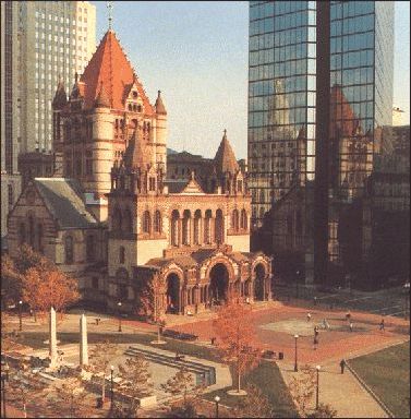
The Good: Trinity Church 1877. This wonderful Romanesque Revival building by H.H.Richardson communicates not only religious strengths but the social strength of its Brahmin congregation. A jewel now overshadowed and overwhelmed by its W.W.F. neighbor Mr. Hancock. Like the comparison of old and new money, Trinity is refined and subdued while Mr. Hancock's lack of breeding is evident by his ostentatious display of self importance and disregard for what is acceptable in certain company. History has a way of repeating itself. In this first instance, Mr.Richardson realized soon after the construction was completed the original design was flawed and needed correction. The facade and spires we see today are actually not the original and may be the work of his apprentice, Stanford White who would later make his mark as a partner in the prestigious firm of McKim, Mead and White, responsible for the design of the Boston Public Library and many more graceful buildings in the Boston area. |
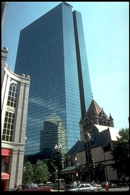
The Badly Placed John Hancock Tower. Completed just over one hundred years after Trinity Church, this 760 foot shard of glass was designed by Henry Cobb of the firm I.M.Pei. This firm has designed many wonderful buildings that enhance the fabric of Boston, but this isn't one of them. Maybe in another area it would be true of this building, but two million square feet of office space on this small site occupied by Victorian landmarks just doesn't work. And speaking of doesn't work, of the many engineering oversights that plagued this building including the possibility of it actually falling over on itself, most people only remember the windows falling out, giving it the dubious honor of being labeled the Plywood Palace! Now that the problems have been solved, if you look closely at the reflection in the glass you can see the old Hancock building which still serves to forecast the weather, if you know the poem. |
 .
.
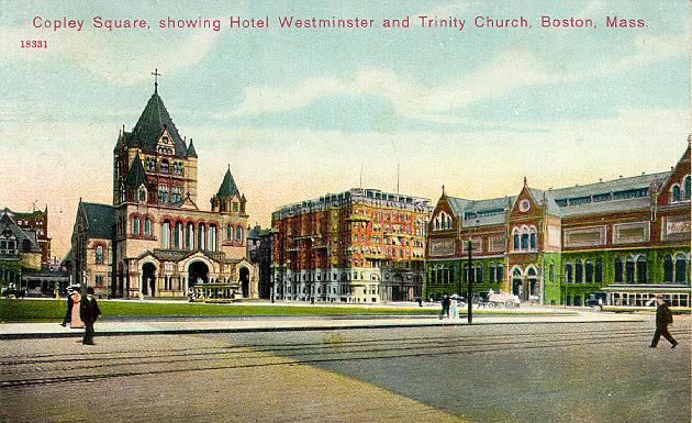
Copley Square 1878 showing the Hotel Westminster and the original Museum of Fine arts on the right. While all of these buildings command their own importance, they work well together without fighting for attention. This synergy is now lost in Copley Square in the name of progress. The monstrous Hancock Tower looms over his old neighbors upsetting not only the charm of the area but the water table beneath them as well. What some call good design is just a case of the Emperor's new clothes.
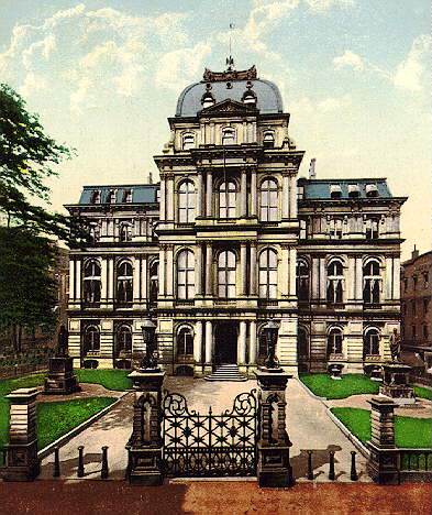
A jewel that still shines: Boston City Hall of 1835
is an approachable building that represents a house of government which truly respected the citizens it served. Built in the French Second Empire style it is now home to some of the finest French cuisine in Boston.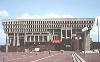
The Ugly: Boston's New City Hall of 1977 is a cryogenic temple for Boston's bureaucrats. The rough concrete style is aptly termed "brutalist." And to think this was the winning entry in a design competition! The architects initially suggested putting a beer garden on the lower floor, probably thinking that after a few rounds the building would start to look better to people. If you think the outside is bad, wait until you go inside! It echos more then the Grand Canyon and visitors can't even find their way to pay parking tickets let alone to the offices of our public servants. If it did have a bar inside, at least we'd have a chance of finding some of them.Not all that's old is good and not all that's new is bad. Come walk with me a little farther...
see more of Boston's Good, Bad and Ugly architecture...IMHO
______________________________________________________________________
Link to Boston's Best...Link to Boston's Worst...Nosh Time...Best View in Town
The worst building in Boston and where to go so you don't have to look at it!